

In the realm of User Interface (UI) design, color isn’t just a visual element; it’s a powerful tool that influences user perception, emotions, and behavior. This comprehensive guide delves into the intricacies of color psychology and color theory, providing valuable insights for UI designers looking to create impactful and visually engaging interfaces.
Color Psychology & Color Theory Guide for UI Design
Understanding the Impact of Colors on User Experience
Colors play a pivotal role in shaping the way users perceive and interact with digital interfaces. Each color evokes specific emotions and associations, making it essential to choose the right color palette to align with the brand’s message and user expectations. Integrating the principles of color psychology and color theory enables designers to create visually harmonious and emotionally resonant UIs.
The Basics of Color Psychology
Color psychology explores the psychological effects of colors on human behavior and emotions. Different colors evoke distinct feelings and responses, influencing users’ perceptions of a brand or application.
Key Colors and Their Meanings
- Red: Often associated with passion, energy, and urgency. It can be attention-grabbing but should be used sparingly due to its intensity.
- Blue: Symbolizes trust, reliability, and calmness. It’s a popular choice for corporate and tech-related designs.
- Green: Represents growth, harmony, and nature. It’s commonly used for eco-friendly and wellness-oriented applications.
- Yellow: Radiates positivity, warmth, and optimism. It can be used to draw attention and create a sense of happiness.
- Purple: Signifies luxury, creativity, and spirituality. It’s often used for high-end brands and artistic platforms.
Applying Color Theory to UI Design
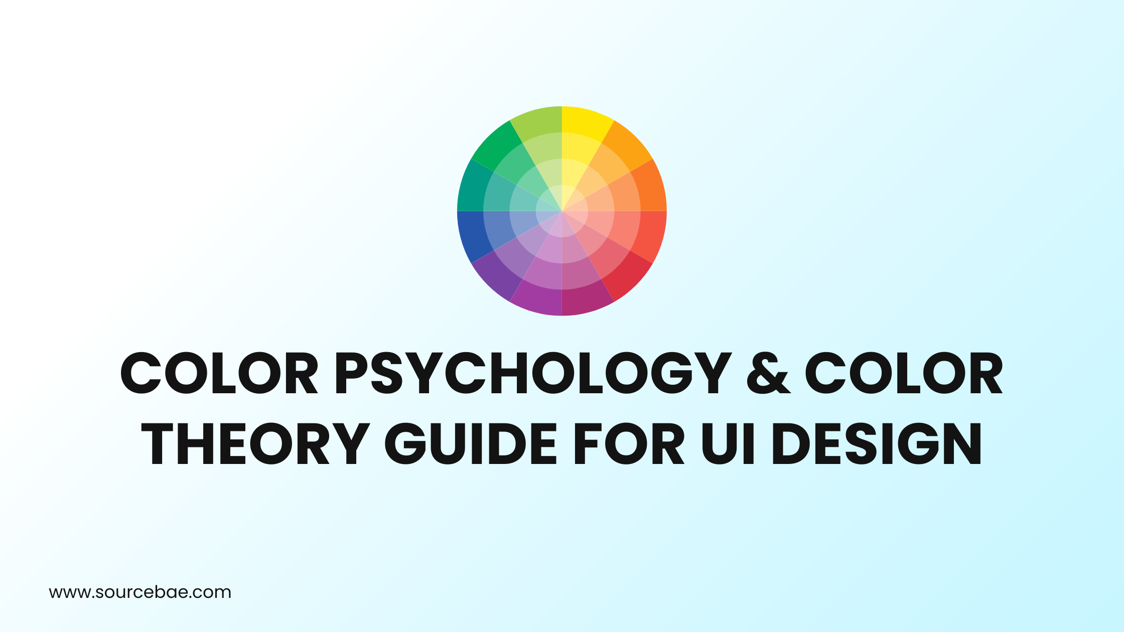
Color theory provides a structured approach to combining and using colors effectively. Designers should consider concepts like color harmony, contrast, and color schemes to create visually pleasing interfaces.
Color Harmony
Achieving color harmony involves selecting colors that complement each other and create a balanced composition. Analogous, complementary, and triadic color schemes are popular choices for achieving harmony.
Contrast and Readability
High contrast between text and background colors enhances readability, making content more accessible to users. Proper contrast also guides users’ focus to essential elements on the interface.
Color Schemes for UI Design
- Monochromatic: Utilizes variations of a single color to create a clean and minimalist look.
- Analogous: Combines colors adjacent to each other on the color wheel for a harmonious and soothing effect.
- Complementary: Pairs colors opposite to each other on the color wheel to create dynamic and attention-grabbing compositions.
Using Colors to Evoke Emotions
Colors have the remarkable ability to evoke specific emotions and associations. By strategically selecting colors, designers can create interfaces that resonate with users on a deeper level.
Warm Colors vs. Cool Colors
Warm colors like red, orange, and yellow evoke energy and passion. Cool colors such as blue, green, and purple instill a sense of calmness and relaxation.
Cultural and Contextual Considerations
Colors can hold different meanings in various cultures and contexts. Understanding these nuances is crucial to creating inclusive designs that resonate with diverse audiences.
FAQs
- How does color choice impact user engagement?
Color choice significantly impacts user engagement as it affects how users perceive and interact with a website or application. The right color palette can capture attention, guide users’ actions, and enhance overall user experience. - What is color contrast accessibility?
Color contrast accessibility refers to the level of contrast between text and background colors. It ensures that content remains readable, especially for users with visual impairments. Following accessibility guidelines improves inclusivity and usability. - Can I use multiple color schemes within the same interface?
Yes, you can use multiple color schemes within the same interface, but it’s essential to maintain visual coherence and ensure that the different schemes complement each other. - How can I choose colors that resonate with my target audience?
Conduct thorough research on your target audience’s preferences, cultural background, and psychological associations with colors. A deep understanding of your users will help you choose colors that resonate with them. - Is it possible to create a cohesive UI using only one color?
Yes, creating a cohesive UI using only one color, known as a monochromatic color scheme, is possible. By varying shades and tones of the chosen color, you can achieve visual interest and depth. - What role does color play in brand identity?
Color plays a significant role in brand identity by influencing how customers perceive and remember a brand. Consistency in color usage across various touchpoints helps establish a strong and recognizable brand identity.
Conclusion
Mastering the art of color psychology and color theory is a vital skill for UI designers aiming to create compelling and user-centric interfaces. By understanding the emotional impact of colors, harnessing the principles of color theory, and considering cultural contexts, designers can craft interfaces that resonate with users, enhance user experience, and elevate brand identity.
Remember, every color choice is a strategic decision that shapes user perception, and embracing the principles of color psychology empowers designers to create interfaces that truly captivate and connect.