

Creating Responsive Footer with react and taiwlindcss
When it comes to web development, creating a responsive footer is not just about aesthetics; it’s a crucial component that contributes to a seamless user experience. In this comprehensive guide, we’ll walk you through the process of crafting a responsive footer using the dynamic duo of React and Tailwind CSS. Whether you’re a seasoned developer or a newcomer to the field, these 10 expert tips will help you build an outstanding footer that adapts beautifully across various devices.
Before we delve into the specifics, let’s start with a quick overview of what a responsive footer is and why it matters for your web projects.
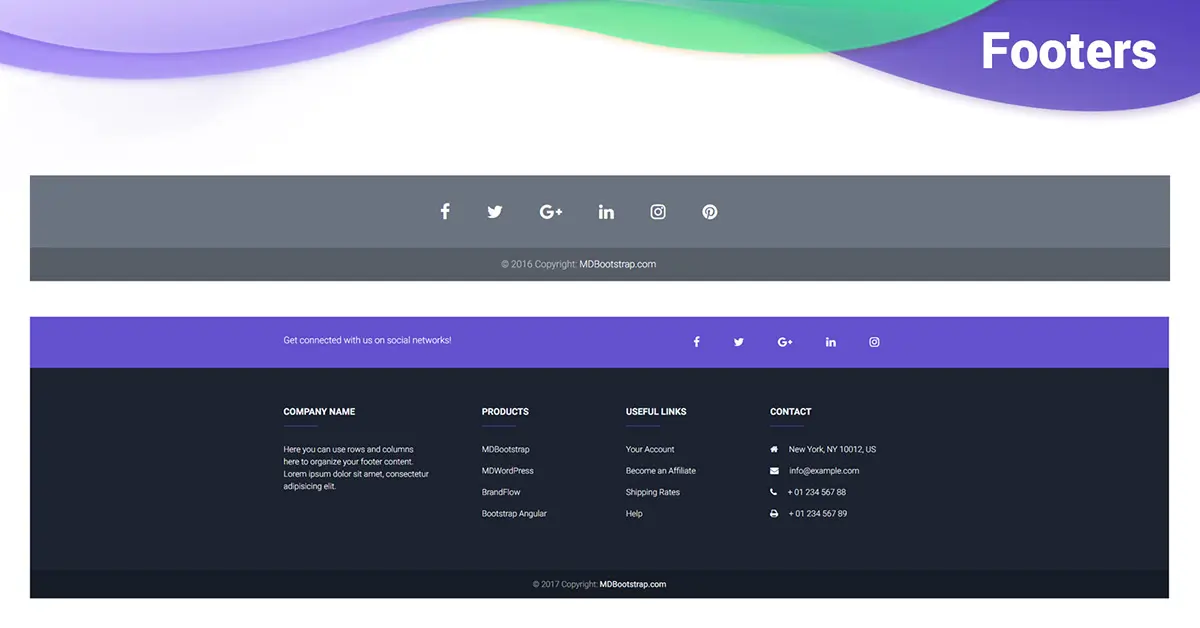
A responsive footer, as the name suggests, is a section located at the bottom of a web page that adjusts its layout and content based on the screen size and device type. It’s an integral part of a website’s design, providing essential information, navigation links, and contact details. Creating a responsive footer ensures that users have a consistent and user-friendly experience, regardless of whether they’re browsing on a desktop, tablet, or smartphone.
Expert Tips for Crafting a Stellar Responsive Footer
1. Begin with a Solid Structure
Creating a responsive footer starts with a well-structured foundation. Begin by designing the layout and deciding on the content elements you want to include. Use semantic HTML elements to build the structure, such as <footer>, <nav>, and <ul>.
2. Leverage the Power of React
Integrate React into your project to add dynamic behavior to your footer. React’s component-based architecture allows you to create reusable UI components, making it easier to manage and update your footer’s functionality.
3. Implement Tailwind CSS for Effortless Styling
Tailwind CSS is a utility-first CSS framework that simplifies the styling process. Use its classes to style your responsive footer without writing extensive custom CSS. Its responsive design utilities make it a perfect fit for creating footers that adapt flawlessly to different screen sizes.
4. Prioritize Mobile-First Design
When designing your responsive footer, adopt a mobile-first mindset. Start by crafting the footer layout for mobile devices and progressively enhance it for larger screens. This approach ensures a smooth user experience across all devices.
5. Utilize Flexbox for Layout Flexibility
Flexbox is a powerful CSS layout model that provides an intuitive way to design flexible and responsive layouts. Apply Flexbox properties to your footer’s components to achieve a consistent layout that adjusts seamlessly to various screen dimensions.
6. Optimize Media for Different Viewports
Ensure that images and media within your footer are optimized for different viewports. Use responsive image techniques and consider using modern formats like WebP to deliver high-quality visuals without compromising performance.
7. Add Interactive Elements Sparingly
While interactive elements can enhance user engagement, avoid overloading your footer with unnecessary interactivity. Include only essential elements like contact forms, social media links, and quick navigation.
8. Test Across Various Devices
Thorough testing is essential to ensure your responsive footer works as intended across a range of devices and screen sizes. Use browser developer tools and testing frameworks to identify and fix any layout or functionality issues.
9. Include Accessibility Features
Make your responsive footer accessible to all users, including those with disabilities. Use semantic HTML, add appropriate alt text to images, and ensure that interactive elements are navigable using keyboard controls.
10. Stay Updated with Best Practices
Web development is a constantly evolving field. Stay updated with the latest trends and best practices in responsive design, React, and Tailwind CSS. Regularly update your projects to incorporate new techniques and technologies.
FAQs
Q: How do I structure a responsive footer layout?
A: Begin with semantic HTML elements like <footer>, <nav>, and <ul> to create the basic structure. Then, use Flexbox for flexible layout design and Tailwind CSS for styling.
Q: What is the advantage of using React for my footer?
A: React’s component-based architecture allows for the creation of reusable UI components, making it easier to manage and update your footer’s functionality.
Q: Can I add interactivity to my responsive footer?
A: Yes, you can add interactive elements like contact forms and social media links. However, ensure you don’t overwhelm the footer with excessive interactivity.
Q: How can I test the responsiveness of my footer?
A: Use browser developer tools to simulate different screen sizes and test your footer’s responsiveness. Additionally, consider using testing frameworks for more comprehensive testing.
Q: Why is accessibility important for a responsive footer?
A: Accessibility ensures that all users, including those with disabilities, can access and interact with your footer. Use semantic HTML and provide appropriate alternative text for images.
Q: Where can I find resources to stay updated on responsive design trends?
A: Follow reputable web development blogs, forums, and online communities to stay informed about the latest trends, techniques, and technologies in responsive design.
Conclusion
Crafting a responsive footer with React and Tailwind CSS is a rewarding endeavor that enhances user experience and showcases your web development skills. By following these expert tips and incorporating best practices, you’ll create a footer that not only looks great but also functions seamlessly across various devices. Remember to prioritize user accessibility and stay informed about industry trends to ensure your footers remain top-notch in the ever-changing landscape of web development. So, go ahead and start creating captivating and responsive footers that leave a lasting impression on your website visitors!
SOURCEBAE: HIRE REACT DEVELOPER