

Understanding Data Visualization: Tips and Tricks
Data visualization is a pivotal skill in the age of information overload. As we navigate through vast datasets and complex information, the ability to effectively communicate insights becomes paramount. Whether you’re a business analyst, a researcher, or a student, understanding data visualization techniques empowers you to convey information succinctly, making it comprehensible and actionable. In this comprehensive guide, we will explore essential tips and tricks that enable you to master the art of data visualization, turning raw numbers into meaningful insights.
Data visualization is more than just charts and graphs; it’s a language that transforms data into a narrative. With the right techniques, you can communicate complex information with clarity and impact. Let’s dive into the realm of data visualization and uncover its core principles.
The Power of Visual Representation
Visuals have a unique ability to convey information quickly and effectively. Our brains process images faster than text, making visualizations a powerful tool for conveying insights. Using visual elements such as color, size, and shape, you can highlight patterns, trends, and anomalies in your data, allowing for intuitive understanding.
Choosing the Right Visualization
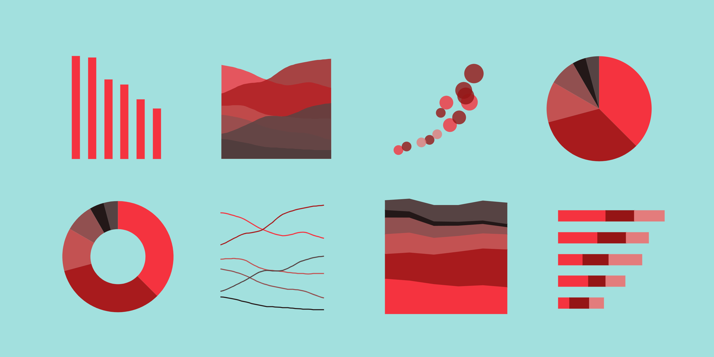
Not all data is best presented in the same format. The choice of visualization depends on the type of data and the story you want to tell. Bar charts, line graphs, scatter plots, heatmaps, and more each have their strengths. Consider the data’s dimensions and relationships to select the most appropriate visualization method.
Crafting Engaging Narratives
Every data visualization should tell a story. It’s not enough to display numbers; you need to guide your audience through the insights you’ve uncovered. Start with a clear title and provide context for the data. Use annotations, labels, and captions to highlight key points and guide your audience’s interpretation.
Data-Informed Design
Design plays a crucial role in data visualization. Cluttered or confusing visuals can obscure insights rather than reveal them. Utilize whitespace, gridlines, and consistent color schemes to create visually pleasing and informative graphics. Remember, simplicity is often the key to clarity.
Interactivity and Exploration
Interactive visualizations allow users to engage with the data directly, fostering a deeper understanding. Tools like tooltips, filters, and drill-down options empower users to explore the data from various angles, leading to more meaningful insights.
FAQs: Unveiling Common Queries
How can I enhance the effectiveness of my data visualizations?
To enhance your data visualizations, focus on simplicity, storytelling, and context. Choose appropriate visuals, eliminate clutter, and provide clear labels and explanations. Engage your audience’s emotions and curiosity by crafting a narrative that guides them through the data.
What tools are recommended for creating data visualizations?
There are various tools available for creating data visualizations, catering to different skill levels. Beginners might find tools like Tableau Public and Google Data Studio helpful, while more advanced users might opt for Python libraries like Matplotlib and Seaborn.
What’s the significance of color choice in data visualizations?
Color choice greatly impacts the readability and interpretation of visualizations. Use color strategically to highlight key data points and differentiate between categories. Stick to a consistent color palette, considering color blindness accessibility.
How do I determine which visualization type to use?
Choosing the right visualization depends on your data and the insights you want to convey. Bar charts are ideal for comparing categories, line graphs for showing trends over time, scatter plots for relationships between variables, and pie charts for displaying parts of a whole.
How can interactivity improve data visualization?
Interactivity allows users to explore data on their terms, promoting deeper engagement. Incorporate features like clickable elements, filters, and zooming options to let users interact with the visualization, uncovering insights that are relevant to their queries.
Where can I find reliable data sources for my visualizations?
Reliable data sources are crucial for accurate visualizations. Government websites, research institutions, and reputable organizations often provide datasets for public use. Make sure to verify the credibility and integrity of the data before incorporating it into your visualizations.
Conclusion: Empowering Insightful Communication
In the ever-evolving landscape of data, the ability to translate raw information into insightful visual narratives is a valuable skill. By understanding the principles and techniques of data visualization, you can convey complex ideas with simplicity and impact. Remember, data visualization is not only about charts and graphs—it’s about storytelling, design, and fostering a deeper connection between data and audience. With the right tools, knowledge, and creativity, you can unlock a world of insights that drive informed decisions.
Incorporate these tips and tricks into your data visualization endeavors, and watch as your ability to communicate data-driven insights reaches new heights. Whether you’re presenting to colleagues, clients, or the general public, effective data visualization will set you apart as a communicator who can bridge the gap between data and understanding. Start your journey today and elevate your data visualization skills to the next level!
SOURCEBAE: HIRE REACT DEVELOPER